
A proper graphics design, along with proper installation, makes your racing program look that much better.
If you’re a typical club racer, you probably don’t have the budget of the pros. You’re not going to have new engines every time you’re down a bit on power. You’re not going to have fresh tires each session. But, with a little effort, you can look as good as the pros do.
Your graphics package probably wasn’t designed by a professional, so we turned to one, Chris Payne at Lava Graphix, who does the graphics for the SpeedSource Mazda SKAYCTIV Prototypes, for some pointers on making your race car look as good as possible, not only with the placement of the vinyl, but its application as well.
The first thing to consider is what things must go where; by that we mean what graphic elements are required by the organization or series you race with, and what decals must your car sport in order to get that all-important contingency money. Most organizations such as SCCA and NASA require their own decals, class letters and numbers that are a certain dimension. Most rulebooks specify a contrasting color – no black on dark blue, for example.
That contrasting color rule also applies in other areas. In order to claim Mazda contingency money, the Mazda and MAZDASPEED decals must be in a contrasting color to the paint behind them – say, white or silver if the car is a dark color, black if it’s a light color. They must also go in specific locations – rear fender for the Mazda decals and the nose for MAZDASPEED. You can learn more about proper placement here.
Your numbers, class designation and series stickers are almost always going to go on your door. Lining all this stuff up and figuring out where to place the other stuff – sponsor and other contingency logos – is where it gets tricky.
“Readability is the most important thing,” says Payne. “It’s real important to put some space around logos so that they are readable. I try to make sure things are visible from a distance at speed, which is not always easy to do. Lining things up is a tricky thing. But the car will speak to you; it will kind of tell you where things need to go.”
Payne reminds racers not to clutter up the car – that can really hurt the readability of logos, and thus hurt your chances for attracting further sponsors or partners. He recommends following the height-distance rule, where the space around a logo is equal or greater than the height of the logo. So if the lettering is 4in. high, there should be nothing within 4in. of that logo. From there, it’s picking a reference point to line everything up – it could be a body line on the car or a graphic element on the paint scheme if you’ve done something fancy. But for most, Payne says the rocker panel line works fine.
“Miatas, Mazda3s, I come off the body line, the bottom rocker. I come up and put a parallel tape line from wheel well to wheel well and that gives me a straight line on the car and I forget about all the other body lines. Then you build as you go – step back and make sure everything is correct, and adjust. If you adjust a logo to a new angle, you need to keep the angle the same on all the logos around it; otherwise, it looks screwy,” he says.
Tape is your friend here. Since most die-cut vinyl pieces have a translucent cover paper, you can get a good feel for the placement and angle by taping it up. Tape is also critical to keeping it straight during application.
First, though, you’ll want to clean the surface, and for that Payne prefers denatured alcohol. He also recommends working in a clean, dust-free environment if you can. Then he uses the “hinge” method to actually apply the vinyl.
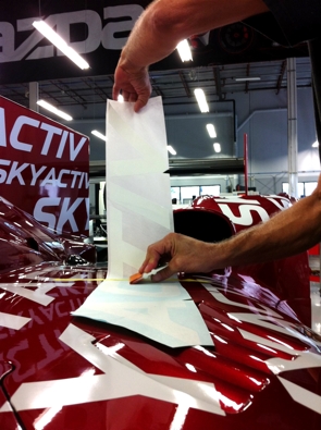 “Let’s assume we’re going to put a Mazda logo on the side of the car,” he says. “I tape it up where I want it, tape on the left and the right to get the thing parallel to the lines I decided to use. Then right down the middle of the logo – horizontally, left to right – I put a piece of tape, which creates a hinge. Then you’re only dealing with half a logo. Hinge it back, cut the backing paper close to the tape, then squeegee it down, holding it off the car. Then you remove the tape and the backing on the other side and squeegee it the other way. It’s a system I’ve used for many years.”
Payne also recommends keeping the squeegee on the paper to make sure there are no bubbles. He will also sometimes use a wet method using an application fluid such as Rapid Tac (which has some useful application instruction videos on its Web site), although he mostly uses that technique when working around curves in the bodywork.
Follow these methods, exercise some care and caution, and your graphics can look as good as the pros. There’s an old motorsports saying that goes something like, “If you can’t go fast, look good.” Why not do both?
You can see Payne applying graphics in the B-Spec Mazda2 build video below.
 ACCESSIBILITY